FACILY - Social e-commerce

FACILY - Social e-commerce

FACILY - Social e-commerce

Description

Facily is a startup in vertiginous growth (the first social e-commerce in Latin America) where I worked in a 4-month period, where a blitz scaling model demanded agility in creating flows, testing scenarios, validating hypotheses with users, and implementation with the development and product teams. I helped to establish product design practices and I found space to take the first steps towards a Design System and Ops culture in the company.

Client

Facily

Year

2022

Type

Mobile App (B2C)

Client

Facily

Year

2022

Type

Mobile App (B2C)

Client

Facily

Year

2022

Type

Mobile App (B2C)

OBJECTIVE

Product Managers wanted to see some new concepts for the product page, backed by data that either justifies or rejects the need for a redesign.

RESPONSABILITIES

As a Product Designer, my task was to develop a new concept, comprehend user behavior, and gather data to validate or invalidate the necessity for changes.

HYPOTHESIS

Based on some user research evidences where users were struggling to figure out how to make a purchase:


How can we make the product page more user-friendly by organizing information and assisting users in their learning process?

Based on some user research evidences where users were struggling to figure out how to make a purchase:


How can we make the product page more user-friendly by organizing information and assisting users in their learning process?

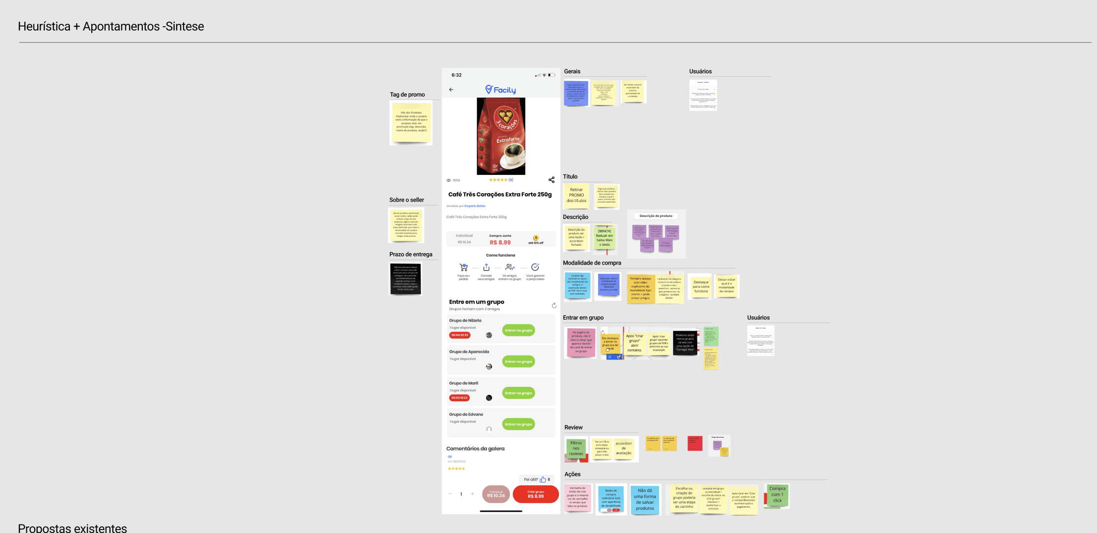
Since we didn't have any data and the user research team was starting to be established in the company, I brought together designers, researchers, and PMs for a heuristics workshop where our primary focus was to highlight the usability issues on the page.


After the workshop,


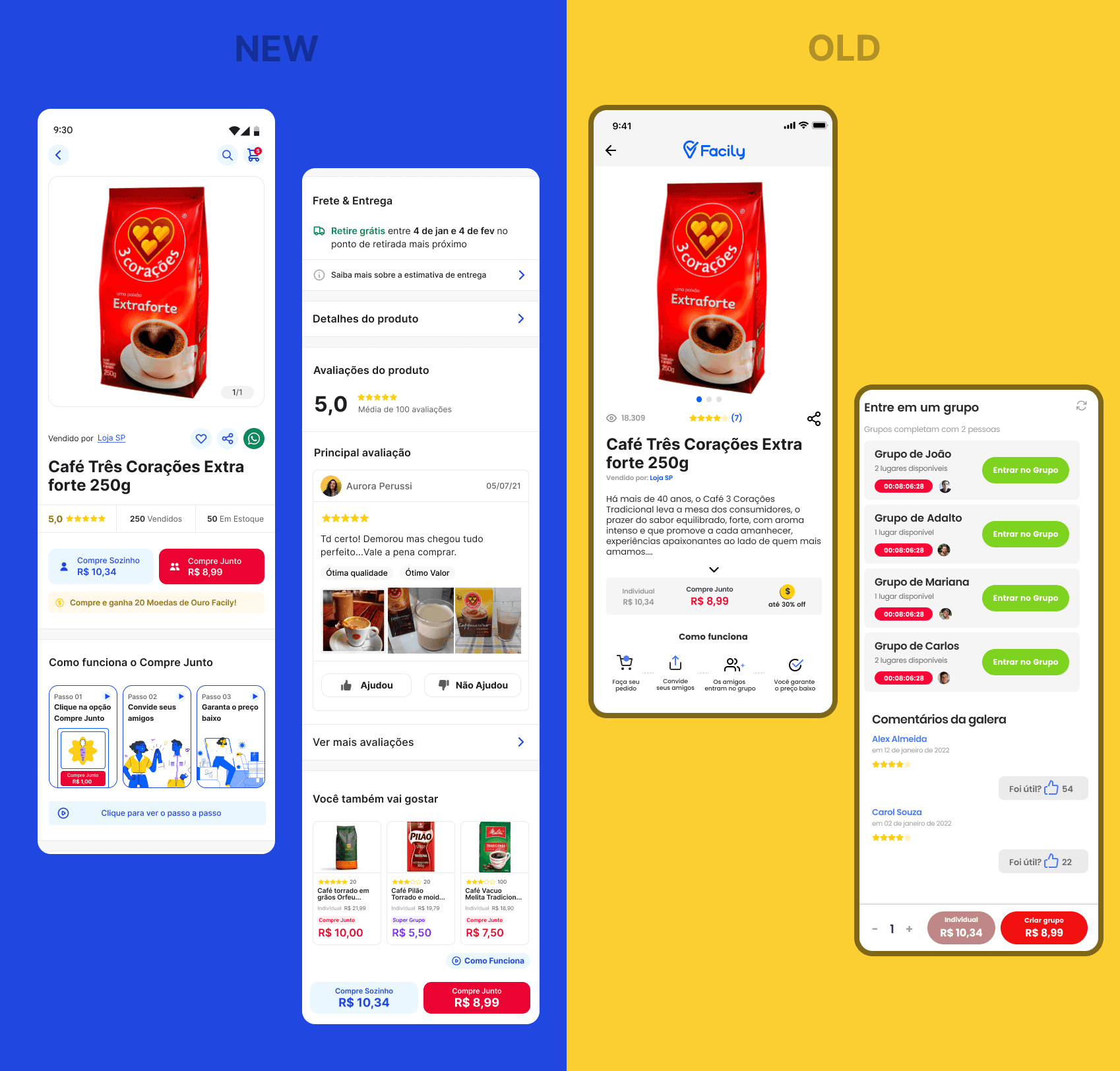
It became evident that the “Entrar no grupo” (buy button) and “Modalidade de compra” (how users can buy) sections were our primary goals, with the majority of identified problems.

Understand

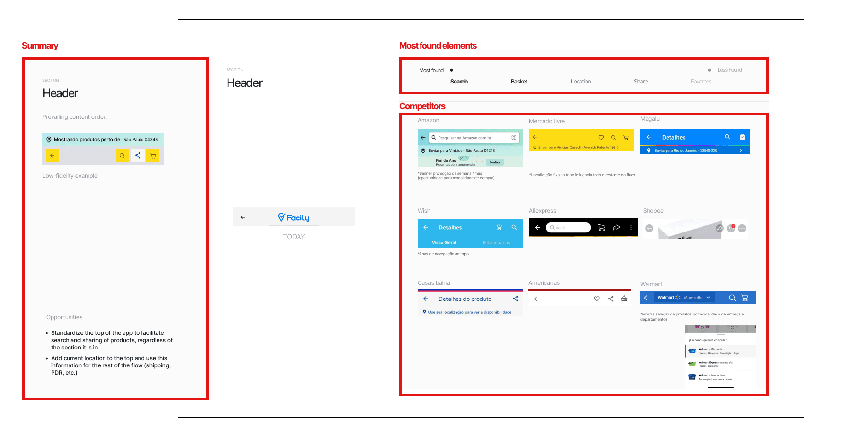
Once we had the stakeholders’ point of view, I divided the screen into 9 parts and conducted an exhaustive benchmark study with more than 15 direct and indirect competitors, as well as consulting case studies from the Baymard Institute.


The focus of the research was to find the most common elements and their respective order in each part of the product page.


This study generated a presentation for the various stakeholders with opportunities in features, content, and information architecture for each piece of the page that would be prioritized by a prioritization matrix, putting all the essential features in the must have quadrant.

Ideate

To amplify possibilities and get feedback in the earlier stages, we ran a 60-minute design critique workshop where designers could analyze each section of the page. After the first round, I took one more round of discussion, closing our first proposal.


Main identify issue and their solutions:


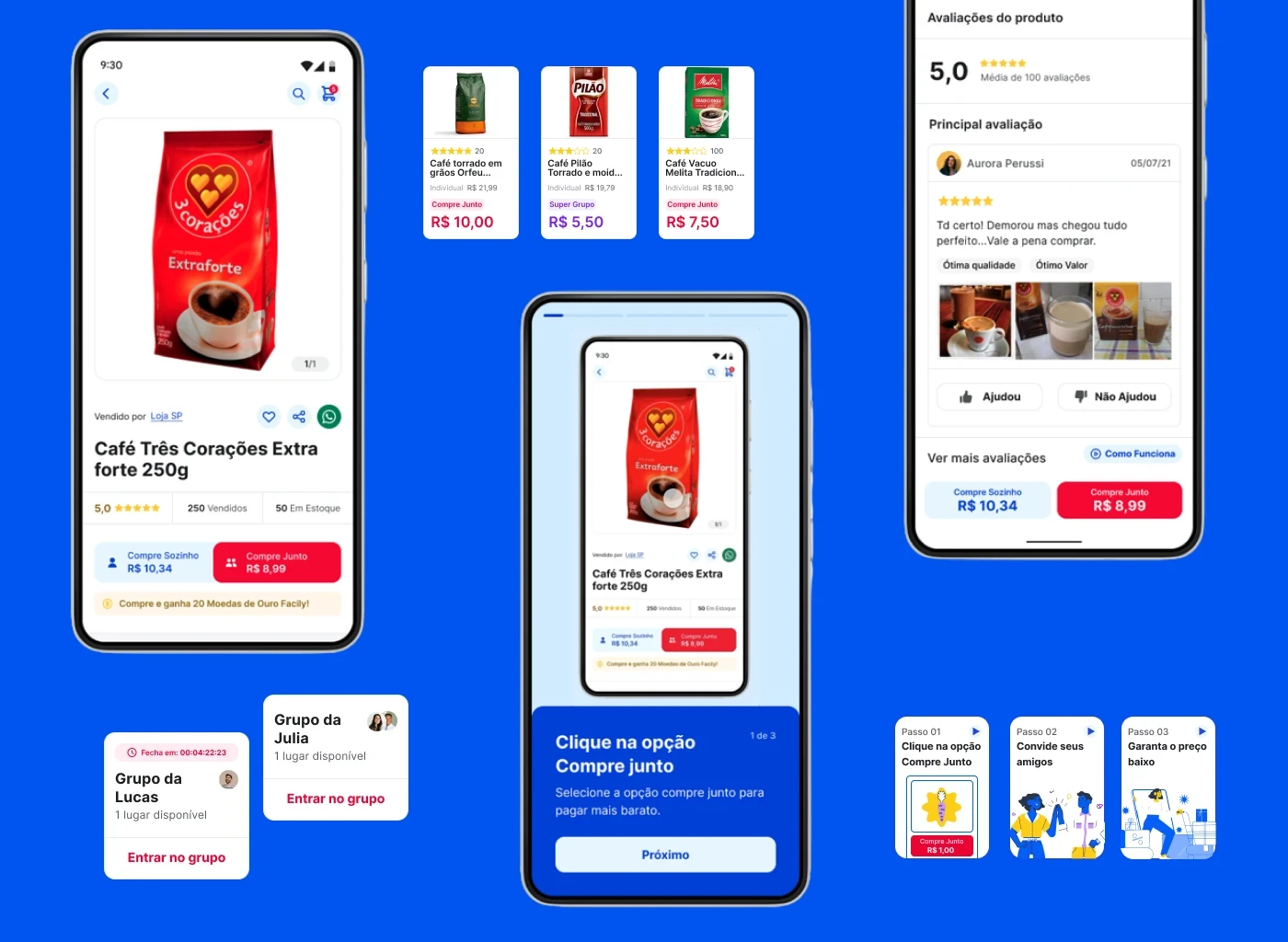
1) How can we help users with their learning curve regarding the purchase process at Facily?


The Facily app had too many different ways to buy stuff and didn't respond to the users questions effectively throughout the navigation. The users always ask somebody for help.


The stories tutorial could be a new, funny and scalable way to help users complete their purchase without asking for assistance from their friends and family.

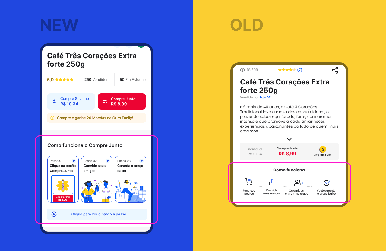
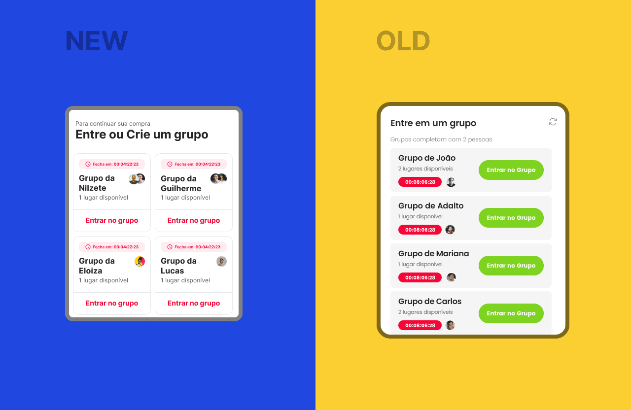
2) The new way to buy

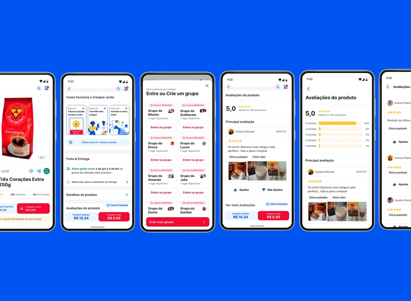
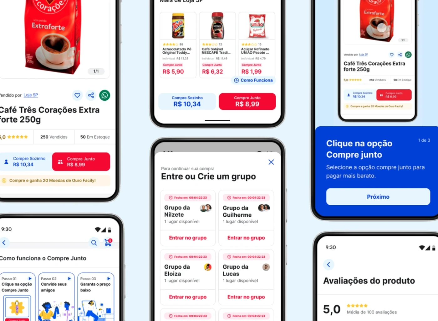
To buy things, Facily users need to join a group with other people to get huge discounts. The old solution placed the groups in the middle of the product page, distracting the user of the product details.

In the new version, we made the page clearer, helping users to do one task at time.


Just after deciding what to buy and click at the add to cart, a modal shows up all the groups they can enter.

User testing

Then we created a plan to understand if our initial ideas could impact the final user experience, resulting in a more engaging experience. The objective of the research was to:


  1. Identify friction points and measure the impact of proposed improvements and new PDP features with users.


  2. Discover how much the usability score of the new product page was better than the old one by addressing heuristic problems identified by the design and product team.


An unmoderated with more then 400 users, followed by a moderated test was done to analyse the performance of the old version vs the new one, comparing usability and user effort, and measuring with CSAT and CES questions.


In comparison, when users are encouraged to make a purchase through the product page, the new concept new concept demonstrates a usability score 21 points higher than the old one, according to Maze analytics.


The product page was the first redesign delivery, making a standard process on helping the product team to find new ways of working and improving the user experience with real user data.

Contact

Questions or design projects? Let's collaborate! I'm here to listen and collaborate to craft design solutions that will shape the world.

Get in touch:

vperussi7@gmail.com