Overview
OBJECTIVE
The client was undergoing a restructuring process in their loyalty and benefits program, where some B2C brands would be phased out, and their products would be integrated into the main app and brand.
RESPONSABILITIES
My role as a product designer was to evolve the existing experience by integrating it with other initiatives within the bank's ecosystem, supporting the management in defining the strategic vision of the product.
During the product transition, the team had many doubts about what the new experience would be like, not to mention that the bank's benefits department had over 19 initiatives spread across the super app ecosystem.
ACTIONS
Multidisciplinary Study Groups
To achieve an unified strategy vision, we formed multidisciplinary study groups comprising Product Owners, researchers, and data analysts to conduct desk research, gathering both quantitative and qualitative data on various experiences.
Workshop facilitation
During these meetings, a UX researcher and I facilitated some workshops using some frameworks to stimulate data acquisition and reflection. These exercises helped us to define a purpose agreed upon by all member.
RESULTS
Introducing a new purpose
"Exercising our role as the Itaú customer benefits aggregator hub through a management environment for earning/using points, redeeming, and accessing benefits."
Guiding the Ideation
Also we developed Guiding Pillars for the customer experience. These pillars would serve as a compass, guiding us in producing and prioritizing solutions that were aligned with them.
Personalization
Showcase Benefits
Communication
Ease Points Management
During those meetings, we also identified and prioritized four main pain points and also discussed some hypotheses on how to solve those problems.
PAIN
SOLUTION
PAIN
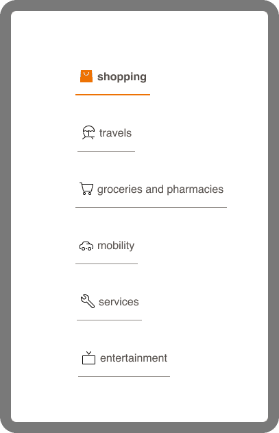
There's a need for a simpler, personalized, and context-driven access experience to benefits.
SOLUTION
Make it easier for users to understand by contextualizing burn and earn mechanics to recurring themes in their daily lives.
Pillars: Personalization, Showcase Benefits
PAIN
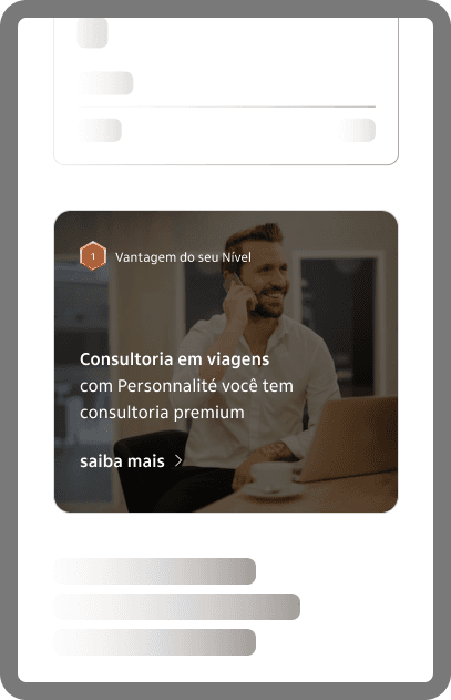
There's a need to organize information retrieval and improve communication of available benefits to the customer.
SOLUTION
Enhancing perceived gains through the display of a shared benefits showcase with a clear definition of banners patterns and the usage of stamps.
Pillars: Communication
PAIN
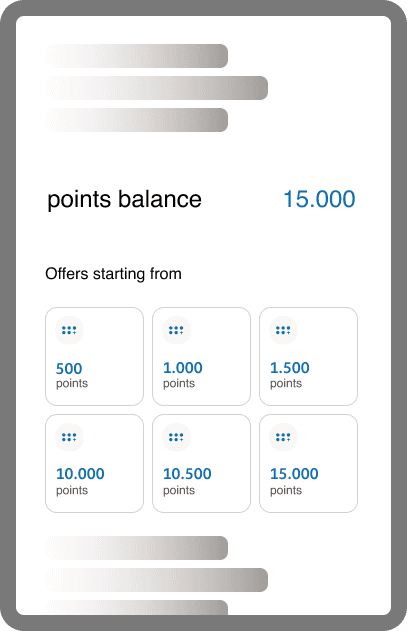
Users feel that points programs have become less advantageous over time. Making points attractive and redeemable is necessary.
SOLUTION
Offer users products and benefits contextualized to their purchasing behavior and points balance.
Pillars: Ease Points Management
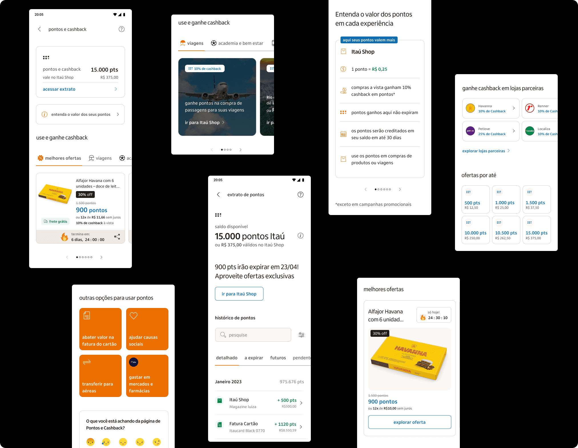
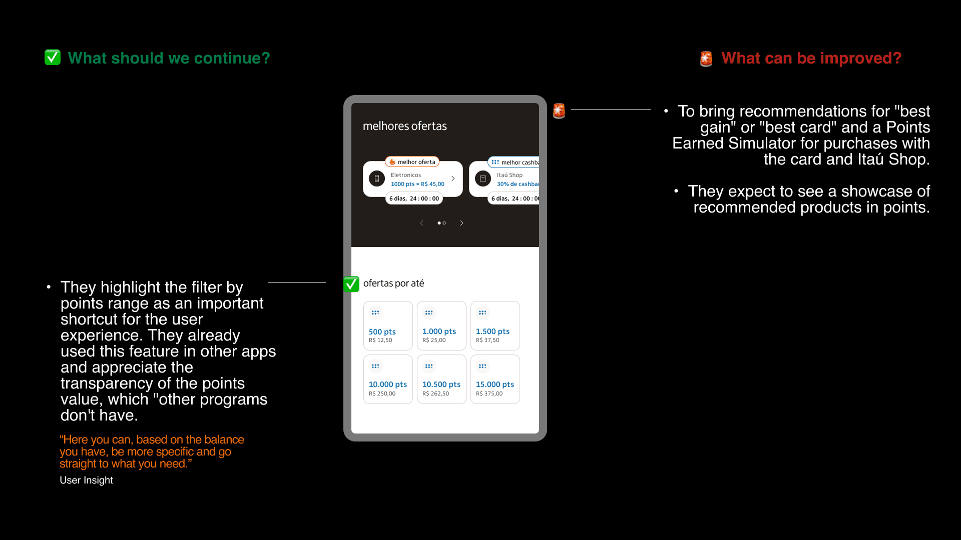
After several stakeholders iterations, usability testing and design critique sessions, we have arrived at our final solution to be iterated with users. Bellow you can see a overview of the final prototype.
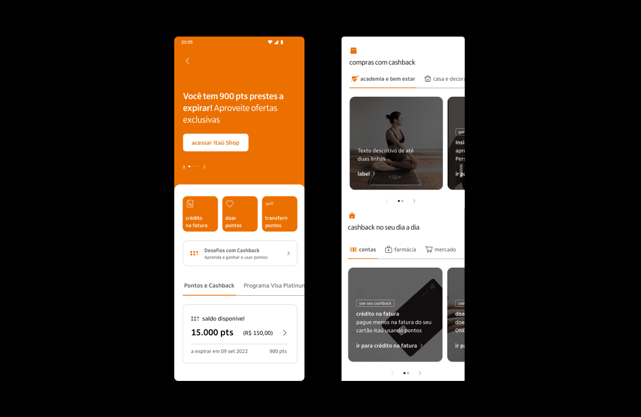
first concept displayed to users
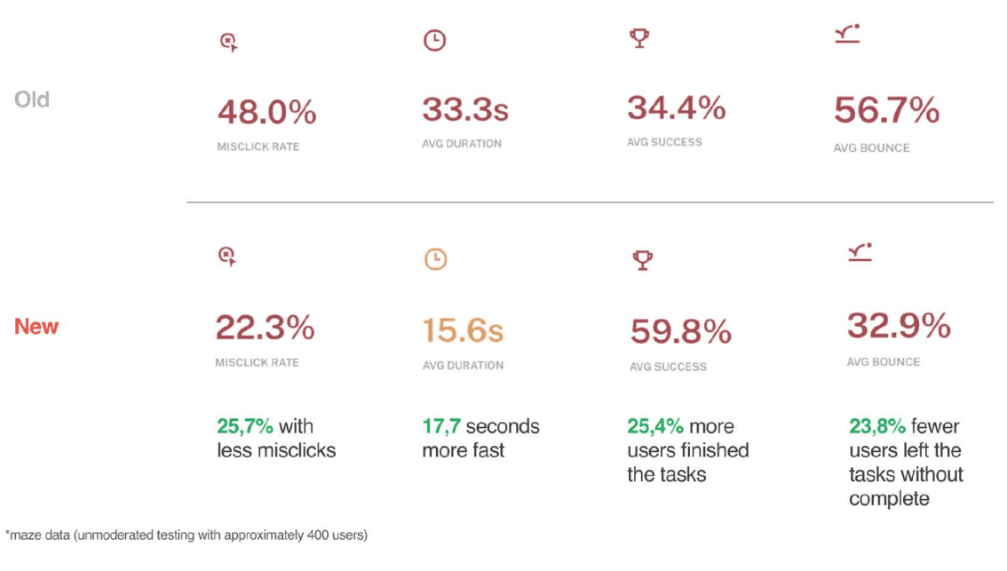
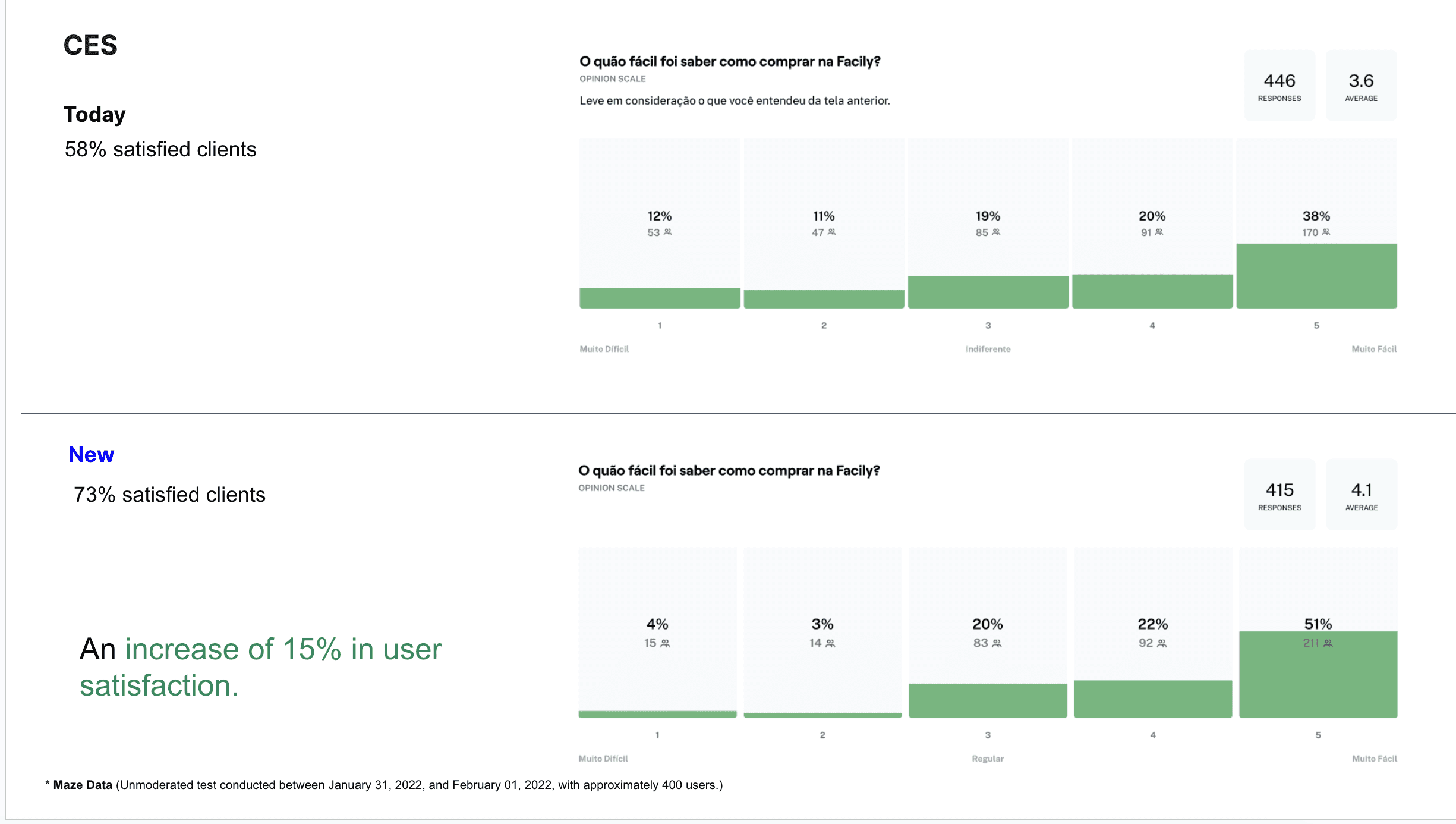
Test 02 - Usability Guerrilha Test (Moderated)
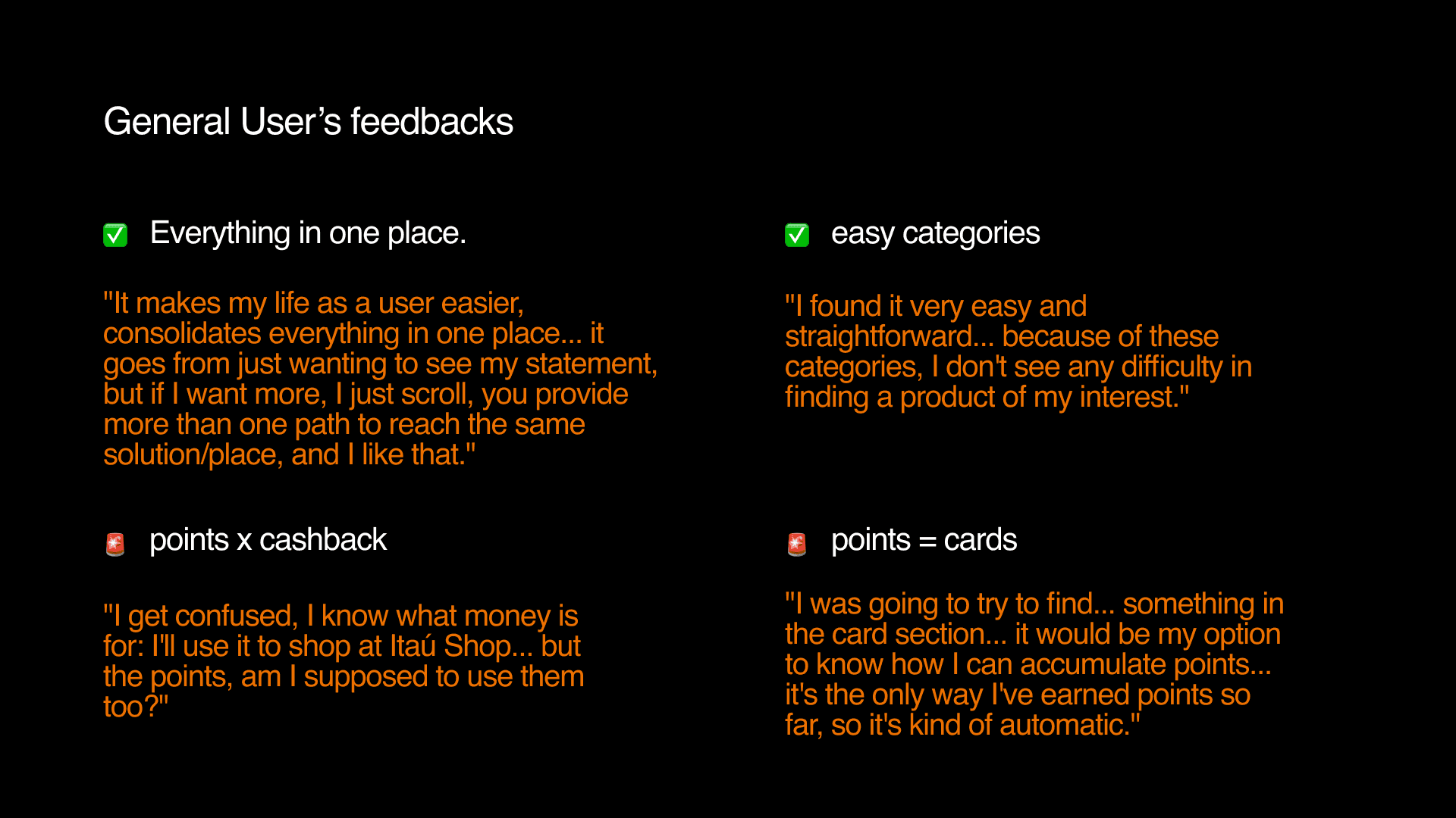
In this test, we evaluate product perceptions through a usability test with users.
Guided by tasks related to points management, earning, and usage, users will perform actions on the main screen and their respective journeys.
Example of Scenarios and Tasks:
"Let's imagine you made a purchase. At the end of the purchase, you were informed that you earned 15% cashback. Based on this scenario, please complete the following task":
Show me where you would find the cashback you just earned.
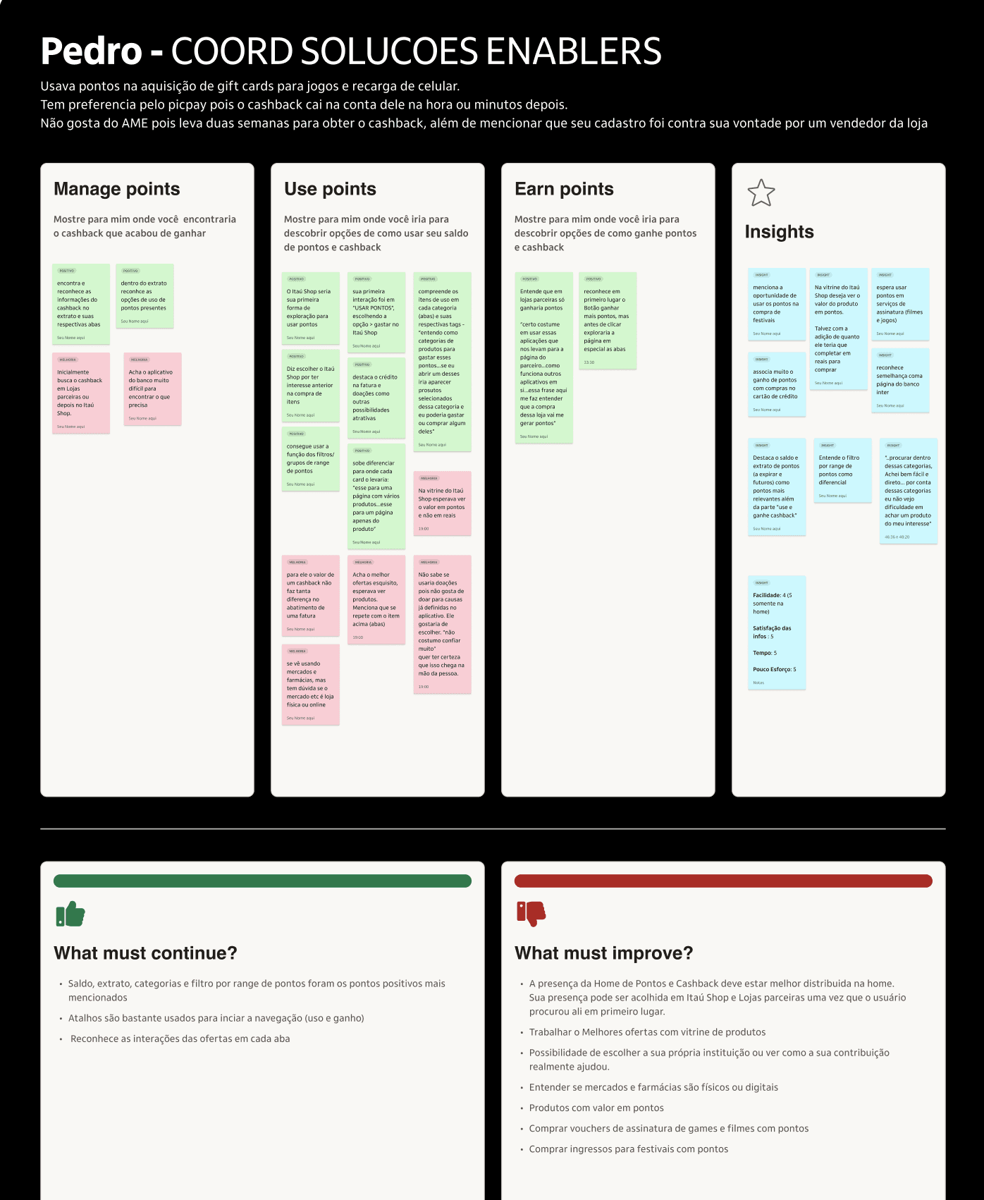
example of usability test report with actions to perform
example of usability test report with actions to perform